
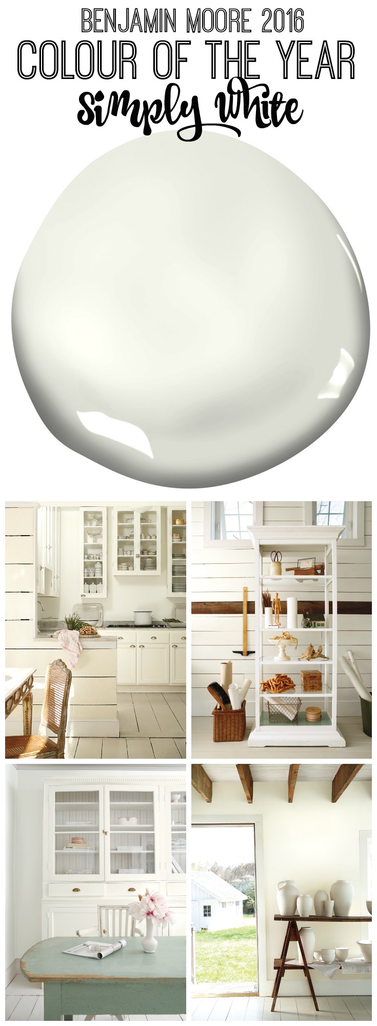
Benjamin Moore 2016 Colour of the Year
I get really excited this time of year when the colour announcements for 2016 come out.
I’m always intrigued by what the year ahead will look like in design and decor, and I play a game with myself to see if any of my colour predictions are correct.
This year I was in a mindset that the Benjamin Moore Colour of the Year for 2016 was going to take the direction of a dark grey or dark purple-grey tone.
It seems like we have been surrounded lately by dark and moody decor trends and saturated deep colours in both fashion and home design so I was pretty sure that the colour for the coming year would reflect this trend.
So I was pretty surprised when Benjamin Moore just announced that their 2016 Colour of the Year is Simply White!
Surprised, and thrilled.
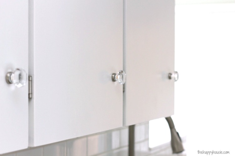
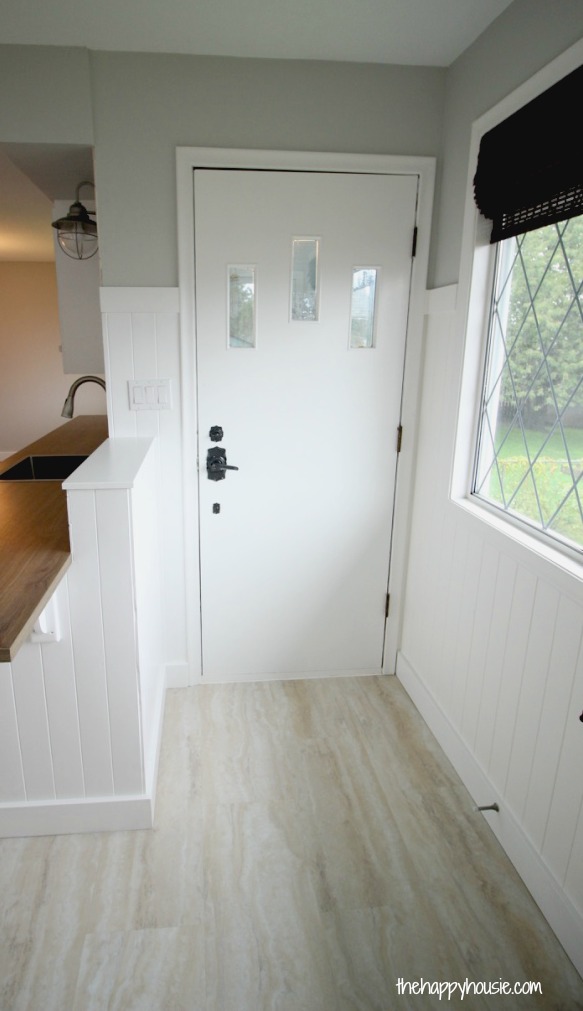
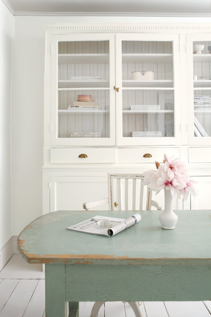
If you are a regular reader then you know that we tackled a big home renovation project this past summer and early fall {we are finished now and details are coming soon!}.
And guess what colour I picked for all the trim, cabinetry, paneling, mantel, doors, and for all the walls in the basement?!?
Um, yup.
I nailed it. Simply White!!
So you may be asking, is white even a colour?
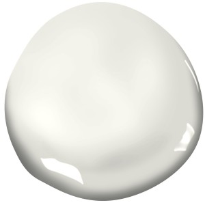
{Benjamin Moore Simply White OC-117}
It seems like actually, whites are more than a colour. According to the colour experts at Benjamin Moore, white is “transcendent, powerful, and polarizing”. Of the most top ten most popular paint colours for Benjamin Moore, different variations of white fill five of these spots.
White goes beyond being just a design or colour trend and is instead an absolute essential in design.
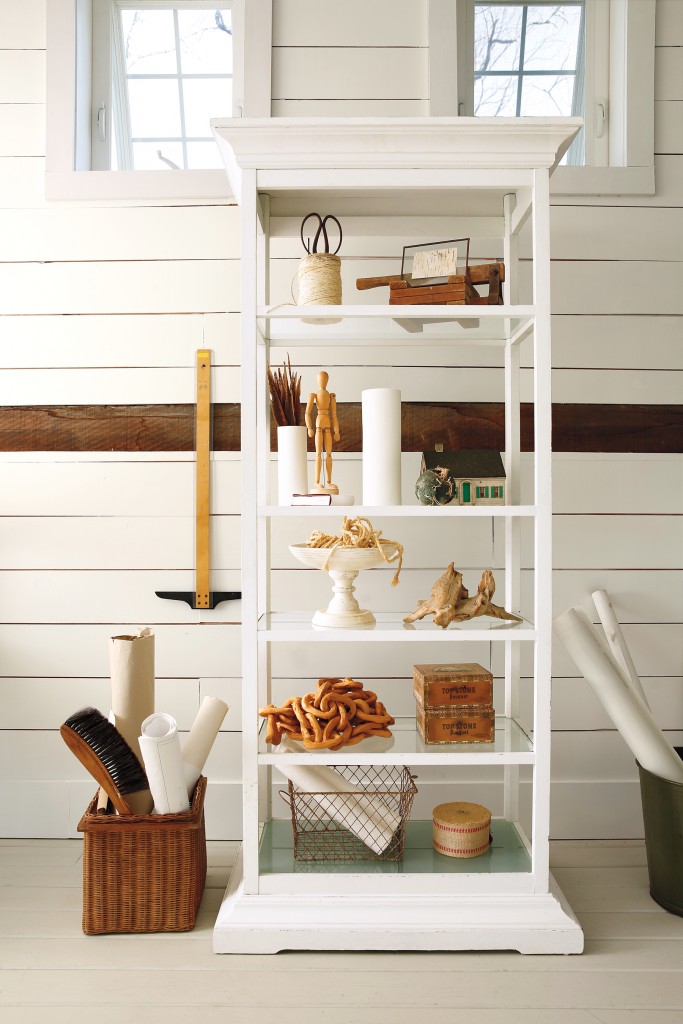
And OC-117 “Simply White” was chosen by the colour experts because it was found to be the most neutral, level, and constant white in various light sources.
I think it is an incredible choice!
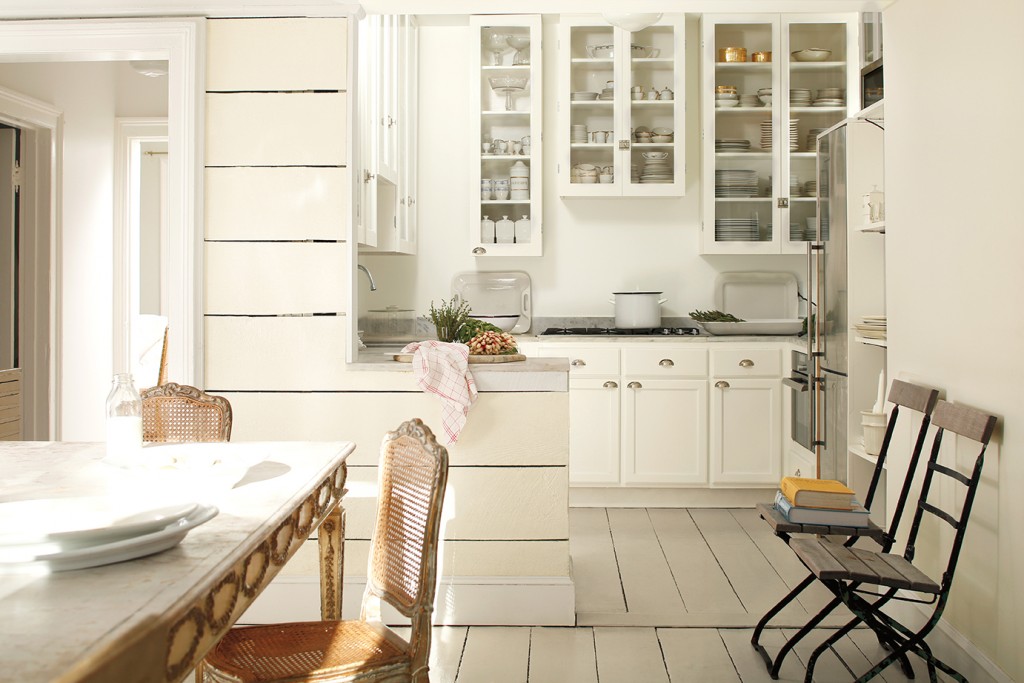
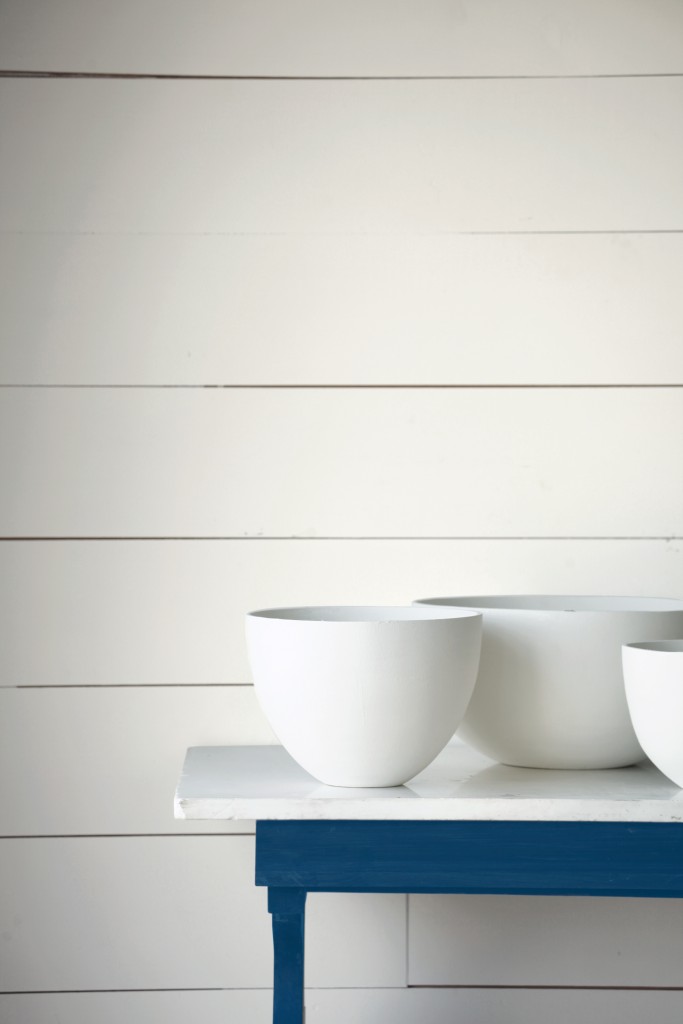
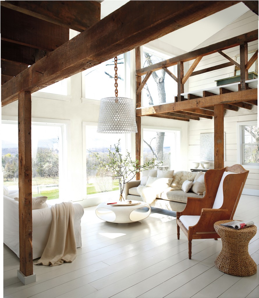
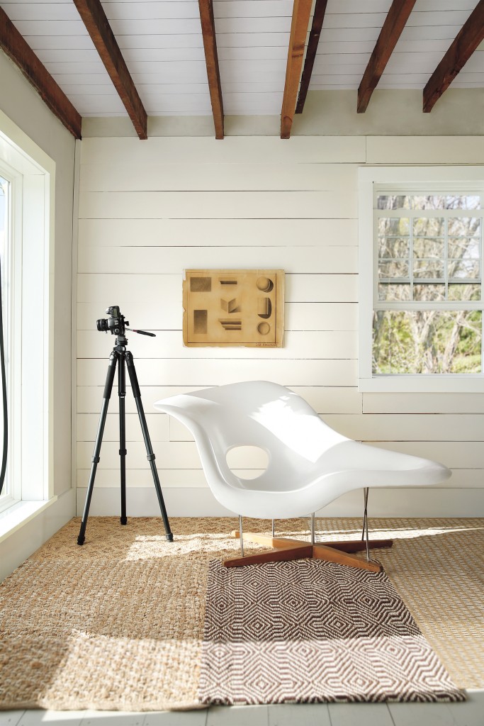
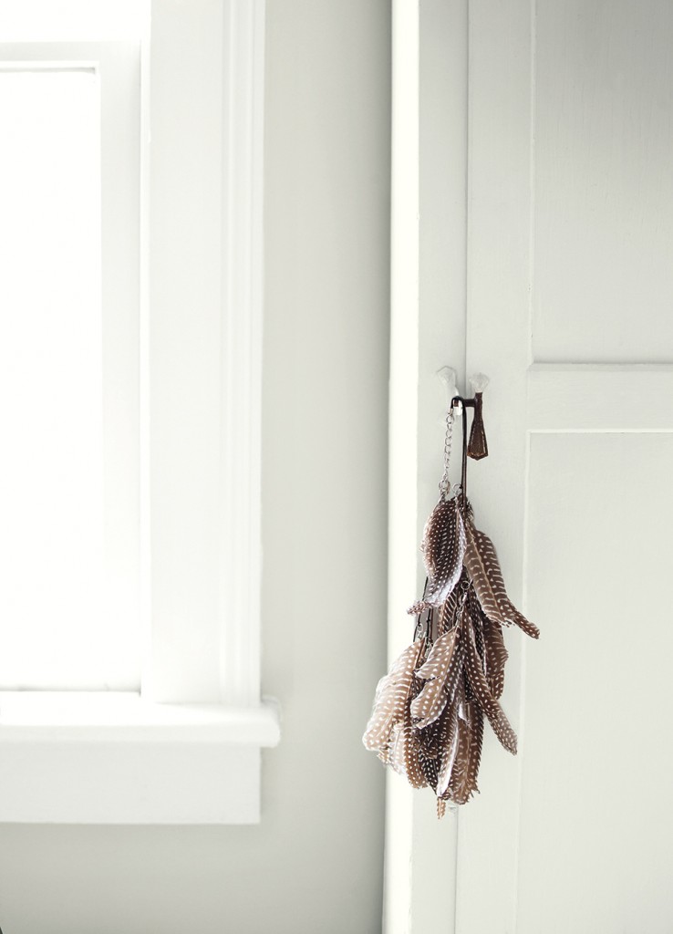
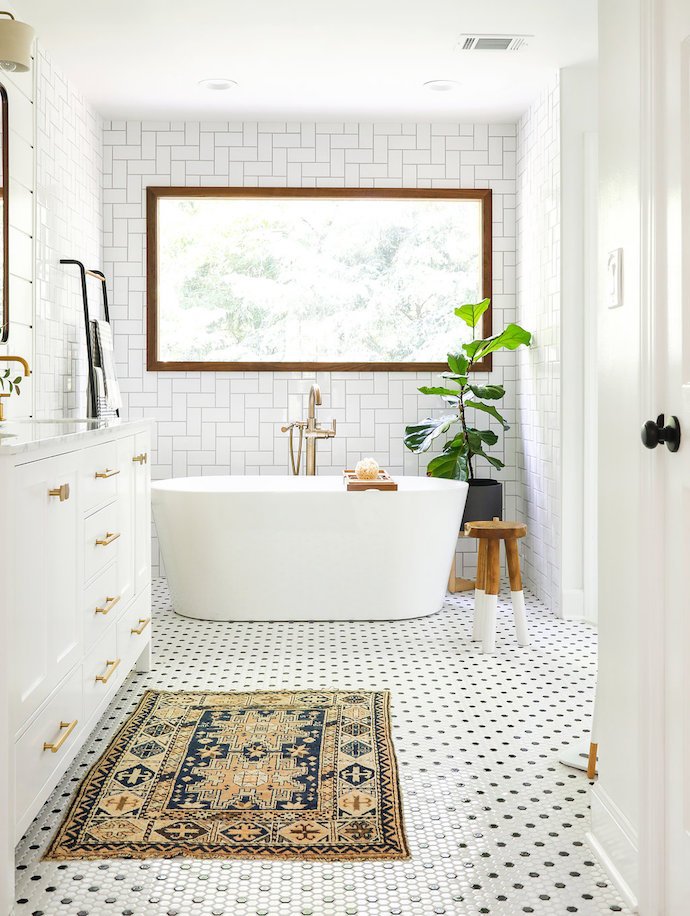
I’ve been so taken lately with gorgeous spaces encompassing that white backdrop look…
But don’t just take it from me! Listen the colour experts from Benjamin Moore tell you all about how they came to this choice for the 2016 Colour of the Year: Simply White.
You all know that I love to use a lot of colour in design. Colour and warm and natural textures.
And white is the perfect backdrop for those hits of colour and texture…
In fact, I seriously considered painting our kitchen/dining/living room white last year rather then the pale blue I finally selected. And I’m still not convinced that I won’t change the living room some time soon.
Imagine how my hits of aqua {and whatever colour I love at the moment} would pop against white walls…
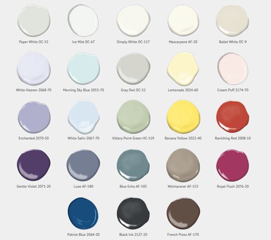
Benjamin Moore’s Colour of the Year announcement also includes a group of 22 colors in addition to Simply White that are predicted to be trending colours for the year ahead.
Another one of my favourite paint colours is included in this mix… Gray Owl:
The others…
You can see the rest of the Colour Trends 2016 Palette and Look-book by clicking here:
To learn more about the Benjamin Moore Colour of the Year and Colour Trends 2016 palette, or to find the closest Benjamin Moore retailer, visit www.benjaminmoore.com
Think you might give Simply White a try?!

You can also search #ColorTrends2016 on social media channels including Facebook (Benjamin Moore Paints), Twitter (@Benjamin_Moore or @BenjaminMooreCA), Pinterest (Benjamin Moore), Instagram (@benjaminmoore) and YouTube (BenjaminMoorePaints).

![]()
![]()
![]()
![]()
![]()
![]()
![]()
Disclosure: Thanks you to Benjamin Moore Canada for the opportunity to collaborate on this post about the Benjamin Moore 2016 Colour of the Year.
I may link up at some of these fabulous places below, for more info check out housie parties: Monday Funday , Inspiration Monday, Nifty Thrifty Tuesday, Project Inspire{d} , Inspire Me Tuesday, The Scoop, Hit Me With Your Best Shot, Wow Me Wednesday, Whimsy Wednesday , From Dream to Reality, The Inspiration Exchange, Wow Us Wednesday, Live Laugh Rowe Live Laugh Linky, Thursdays Are Your Days, Inspire Me Please, Catch as Catch Can, Fabulously Creative Friday, Party Junk, Pinworthy Projects , Link Party Palooza,, Weekend Bloggy Reading, Strut Your Stuff Saturday, Spotlight Saturday, Suburbs Mama , That DIY Party


Hi
I’m thinking of painting our house, and I want to make it brighter, since we have hardwood floors, and windows are also wood, and the french doors. I considered painting my windows white, but my husband thought I was nuts.
My question is… If we paint it white, what’s the rule for ceilings? Does it have to be the same white? What about the doors upstairs and the trim around? Same white? Another white?
Thanks,
Leticia
Wow! I picked Simply White last fall for the color of my guest room! I was ahead of the trend (for once!). I love that you can put bright pops of color or stay more neutral. I love all the rooms you featured too!
Thanks Pamela! I was thrilled that I had chosen it for our bathroom/kitchen paneling and all the trim in the rental project as well – I know what you mean about feeling ahead of the trend, lol!
I love that it is white! I really love all the gorgeous white spaces you found too. So inspirational!
Hi, Krista ~ What a perfect choice for colour of the year! White is such a nice starting point and provides a beautiful backdrop for furniture and accessories. And those pictures are gorgeous!
Thanks Corey – they are stunning images aren’t they?! It is a great backdrop – my sister and brother-in-law painted their house all white last winter and it is stunning. It mixes so well with the warm woods in their ceiling (they have a vaulted cedar planked ceiling with a huge center beam). It is pretty amazing!
I’ve ALWAYS loved white and Simply White is definitely my go-to!
I absolutely loved it in our rental project house, Kristi! Now I am really tempted to do our living room…
I love a neutral white paint as it’s the perfect jumping off point for any design. My favorite is white mixed with wood and I LOVE all the inspiring photos in this post!
I love the contrast of white with warm rustic wood tones as well Katie – even though I have so much colour in our home, I am always taken with that look.
I love that the colour of the year is simply white….anyone can work with that! White is the presence of all colour while black is the absence of colour so in reality you are painting your home with all the colours in the light spectrum! Fun fact of the day! Haha
I guess that is why is feels so bright and full of life?! Great fun fact, Gilly!
Nice colour but would get so dirty if it was in this house
Haha, yes there is an issue with white showing dirt, that is true!
I’m really excited to see Kittery Point Green on their list!! Kittery Point, Maine is a beautiful place to live and visit!!
Oh, I would love to travel to Maine one day!! I can only imagine how beautiful it is!!